Wednesday, May 20, 2015

Scroll-Making, Contemporary Art, and Star Maps

It started with pottery sometime around 1974, really. I was an art student taking pottery. One day I was going through the graduate studio and notice the decoration on some plates. It was a simple splash of red iron oxide slip under a whitish-brown glaze. For whatever reason I connected to this stroke of “controlled accident”. It comes from Japanese Zen pottery, the graduate student told me. It sent me out there. I felt a sense of freedom just looking at it. It wasn't that good, his effort, but I got the spirit of the intent. That was what mattered. I started doing it on my pots. I did some raku firings and that was even more invigorating. Liberating. I had found an expression of freedom that allowed me to shed all the constipated forms of art that surrounded me at the University.

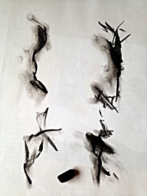
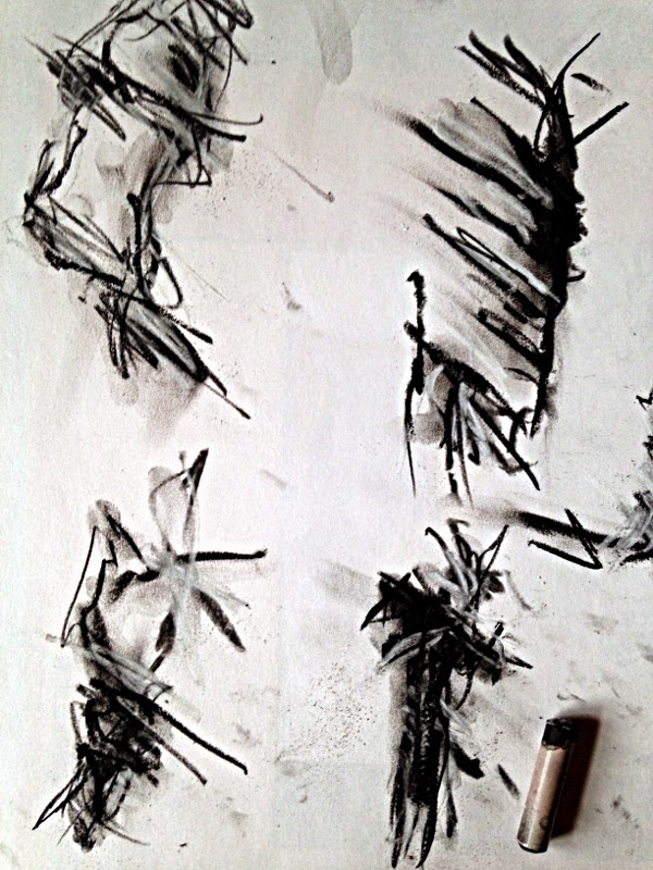
It wasn't long into my studies that I broke away from the common form, bowls, teapots, plates, cups, and started creating sculptures. I loved doing slab pots. I was good on the potter's wheel and good at hand-built pots, but form and function in clay sculpture just took me to the slab. I would throw a ball of clay out on the wedging table until I had a slab and then place it on a support form and add another, clay slip in between, joining them, until I had a form. Then I would splash under-glaze slips on the clay. There was a rhythm to this. It was like music in solid form. I felt free. I wanted to be able to control these splashes on the clay better. I started to practice with tempera paints on newsprint. It was cheap student grade practice material. I would show my newsprint pad to friends. They liked it. I got better. I could make the splash curl around the pot where I wanted it to go. Other students tried to imitate me. My instructors would try their hand at this style I was developing in my work. They tossed them.


"Blue Mud"
1975
Stoneware and Porcelain
7 x 11 x 13 inches

It was just a matter of time before it happened. I wasn't just practicing any longer. I was doing paintings with watercolor on watercolor paper. I read everything about the Japanese Zen painting style that I could find in the library. I memorized all the pottery photographs from the Shinto school of pottery that I could find. I did my background work as a student with no real hands-on instructor at my side. I looked at all the action painters' work from contemporary art. They were off doing something else. We may have been going down parallel paths, but their concerns were clearly different from mine. I found out about sumi-e ink on rice paper. I used rice paper for woodcuts in printmaking and loved that paper. I went to a international student day on campus and discovered that one of the booths had art supplies for sumi-e ink on rice paper painting. I bought a couple of bamboo brushes, and ink stick, and an ink stone. I was doing more with this splash than just decorating my clay sculptures. I was banging the walls of the Universe with the spray from my brush.

After graduating from the University with a degree in Fine Art, I moved up to a log cabin in the mountains. I had to walk in a good twenty minutes from the road. It had a fire place. I bought a gas camping stove and carried water in for cooking and tea. I was a hermit. My mother had given me a roll of paper. I stapled it to the floor of the porch and started painting on it with acrylic. It took weeks to complete the painting. I rolled it up. I knew it was too long to ever display in a gallery. I never thought of it as a scroll painting. No one has ever seen it since then. I unrolled it a few times and looked at it but I never showed it to anyone. At least now I know what I am doing. I bought ten rolls of rice paper from a vendor at the Knoxville World's Fair in 1982. He wanted sheets of paper so a calligrapher could write people's names on it in Chinese. I used that paper for years but never once thought about rolling some of it out and making a scroll, or doing a long painting. It just never occurred to me.


"Red Apples"
watercolor on rice paper
12 x 10 in.
January 26, 1986

A recent conversation back in the winter about my painting style, which has developed beyond how I started out decorating pottery, and a friend mentioned that no one has ever done a scroll in my style of painting. I contemplated this for a few months and could see why no one had attempted this. For one thing, it is a logistical headache. I solved some of those problems back in 1976 with that roll of paper on the porch. That would not be possible where I am living now. I have been painting on small sheets of rice paper for several years and pushed my techniques even further than before. On numerous occasions I've produced videos of myself while working, holding the camera in one hand while painting with the other. The results are more of a performance piece than a documentary. I like it that way. I see this as a dance. One should feel the energy of the body in relation to earth, gravity, physics, zip of the wrist at the release of ink from the bristles. I am dancing. I am alive. I have awakened.

It gets complicated trying to do a scroll painting like this. It has to be a continuous painting. If it were displayed on the wall completely rolled out it would need to look like a continuous painting from start to finish. When an artist is doing a landscape scroll painting he can roll it along with no problem. When it comes to splash, that isn't going to work. Rather than go at the challenge head-on, the best approach is to come around from the side, as in go with what I already know first. Using what I have to work with keeps it even more simple. I have newspapers and old fountain pen ink. It is February. It is snowing. “art_snow” started out in the snow with ten sections of newspapers placed end to end. Blue-black ink happened. The next day red ink happened. On February 23, 2015, black ink happened. Each day in the snow and wind I splashed ink, chased newspapers around with the wind, and documented as much as I could using my iPhone 5c. On the 23rd the wind was brisk and I had to pile a lot of snow on the newspapers to keep them from blowing away. My hands got so cold that when I tried to change the camera settings from video to photo my fingers were so cold that the heat-sensitive screen couldn't detect them. So I stopped taking photographs and took everything inside. Over the next few days I attached the sheets of newspaper end to end with clear acrylic polymer to create the scroll. That was a good dry run at what the challenges were when using what I had.


“art_snow” scroll
ink on 10 sheets of joined newspaper
22.75 x 234 inches | 57.7 x 586.75 cm
February 27, 2015

On April 11, 2015, a shipment of art supplies arrived and in the box was three rolls of rice paper. I sat and looked at them real hard. I pulled them out and felt of the paper. Sometime in the afternoon the smallest and shortest of the three ended up in the back yard. Wet-on-wet sumi-e ink brush marks and splash went down. The wind played with the paper several times, threatening to turn the paper into a kite. I waited until the ink was dry before rolling the paper up. With a title, date, and signature this style of painting, this approach to scroll making, happened. I don't know if it had ever been done before, but I know it is possible. “Pillow Float” was a lot easier than “art_snow”.


“Pillow Float” scroll
Sumi-e ink on Hosho rice paper roll
8 inches x 20 feet
April 11, 2015

It doesn't take long before the peacock spreads his tail feathers and we get some color in the mix. “Grass Float” brought in the watercolor. It also brought in the process of working on a small section each day. I started out with about three feet of paper rolled out. The next day I rolled out an additional three feet and worked on everything that was exposed, so the previous day's work was tied into the new work so it would appear like that continuous painting that gives the impression that it was all worked on at once. The next day I would roll up the first three feet and roll out three more feet of fresh paper from the other end. This started on April 24, 2015, and ended on May 7, 2015. As usual, over 1000 photographs were taken to document the process. After the scroll was completed I started photographing the scroll from start to finish. The camera on my iPhone died on me, so I haven't completed that process as of this writing.


“Grass Float” scroll
Watercolor and Sumi-e ink on Shuji Gami rice paper
18 inches x 30 feet | 45.5 cm x 9.144 m
Completed: May 7. 2015

Now to think back when things were simpler and manageable, disregarding the dead camera on the iPhone. The camera on the front, I call it the “selfie camera”, still works but that leaves me shooting blind if I point it away from me. So the next roll of paper goes down on the “work space” on the bank out back where the retaining wall provides a natural bench to work on. First marks are made with pencil, then oil pastel. I'm rough on rice paper. Next comes the watercolor. The next day I unroll more paper and do the process. Every other day I add the sumi-e ink to the mix. The next day the previous day's work that got the ink gets worked on, so marks go over the ink. Also, I don't roll up all of the previous day's work that is completed. I leave a few inches exposed. So there's a bit of overlap going on all the way through. It gets 
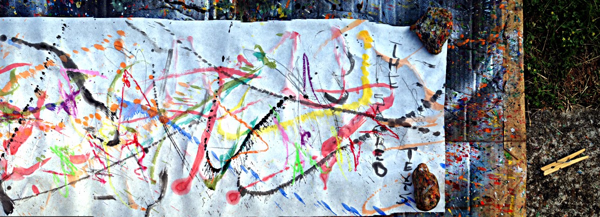
complicated. “The Sacred Texts” scroll was started on May 8, 2015. I thought about taking a break in between these two.

Lacking good documentary photographs for this scroll, I decided to scan the progress on the flatbed scanner. Since it is 11 inches x 60 feet I can do this. The scanner bed will take paper a little larger than letter size. Even so, I'm overlapping some to make sure a little of the previous scan is visble on the next scan. There was about 15 feet of work already completed when I came up with the idea, so I went back and scanned that. Now the problem with scanning the scroll as it progresses is that some of the previous day's work is exposed, so I need to scan any areas that got wet. That makes those few inches of the previous day's scan stale. That doesn't bother me. What might make this problematic is the decision to post the scans to my “virtual gallery” on Zazzle.com. If someone wanted to purchase prints of all the scans and recreate the scroll, the prints won't match up perfectly. The best way to document the scroll would be to wait until it is finished. I don't need the stress at this point in the process. So the Universe gets what I'm dishing out.


“The Sacred Texts”
Pencil, oil pastel, watercolor, and sumi-e ink
11 inches by 60 feet
Started May 8, 2015
Completion date not determined as of this writing

Doing a scroll comes with a mental awareness that is different from regular reality. It is bigger than I am. I can't experience the entire scroll at once, not even in creating it. This gives me an experience somewhat akin to watching a movie. I think about the scrolls that are created to be presented as a performance. Children get a roll of paper and draw cars and buildings on it. They roll it up on a stick on either end and put it inside a cardboard box and create a story screen. Once the scroll is rolled up and I hold it I feel how sturdy it is. I think about how people used to use scrolls before there was bookbinding. They are very easy to transport in lands that are arid or with watertight containers. Making scrolls, working with them, and looking at them gives me a sense of connectedness to humanity over a long period of time. Looking forward, there is information in these scrolls that will transcend time. My style of painting transcends language barriers. It transcends physical reality. The information is just as tangible, will be tangible, to anyone for an unknown period of time on this planet or anywhere else where visual physical information is perceptive. It is bigger than me. It is bigger than all of us. I love science fiction. I could write a novel about any of these scrolls making a journey to the stars and beyond, used for a star map, liberating ego-bound seekers, and once in a while used in a “story screen”. In this movie star travelers use scrolls to navigate with. In this physical realm, we are the star travelers waiting for our maps to be replaced. I'm working as hard as I can. Love.

Oliver Loveday © May 21, 2015, 2 am EDT


For more information about my art work, please visit Loveday Studio.

Saturday, May 16, 2015

Status Green

Status Green

I am awake
I have awakened
Spiritual warrior in the nothingness
It is all experience
Experience the nothingness

My hands ache from this energy
I transfer this energy into this art
I transfer this energy into reality
This physical reality between dreams and nothingness

O, God, how I would quit but then I would have to start all over again
Surviving in this world where pain and suffering are consistent
Humans impose their refusal to accept karma as responsibility
It hurts like hell to be part of their reality

There is bliss beyond the pain and suffering
After the awakening there is mirth and euphoria
Beyond all of this there is a green status of knowing
Beyond this I am only human again


Oliver Loveday © May 16, 2015 2:45pm EDT

"Status Green"
“Status Green”
Watercolor
22 x 30 inches | 56 x 76 cm 120 lb/300 gsm cold press
May 11, 2015

For more information about my work visit Loveday Studio.

Monday, May 11, 2015

Post Mother's Day walk-in special

May 11, 2015, 9:30am EDT

I hate to waste anything if there is a use for it. I also hate to run out of a color that I've mixed up whenever I am painting. It is rather difficult to mix things up the same way twice. The solution is to mix up enough and then some, just to be sure. This leaves some excess. Rather than toss the paint I've been saving cardboard from things like cereal boxes, cracker boxes, and the like. I prime them on the front and back with gesso and add some collage elements. Voila! It isn't archival material which means that you would want to tell your grandchildren to tell their grandchildren to enjoy a painting of this fashion while it lasts.

So for this week only, the “After Mother's Day Sale” here at Loveday Studio, for one week only, I have a selection of ten of these works of art that I'm offering for $50.00 (USD) to the walk-in traffic. Studio visits are the best way to buy art after all. To those that would like to participate via postal parcel, the more postage you add to the amount, the faster it gets there. What that means in studio talk is that if you send me $50.00 from Siberia, I'll splash some paint on a post card, sign it, and send it to you via air mail. Specials offerings are hard to translate into international situations. The primary targeted audience is local traffic after all.

Not wanting to bore you with hardcore sales talk, here's a poem I wrote when I was 18 years old. My poetry isn't free either. It will cost you a moment of gratitude at the very least. Love.

Oliver!

Mother

She smiles
As her little boy grows bigger each day
With bird nests and bees
With rainbows and trees
With each cut and scratch
He grows up

It was she
That carried him inside
And nursed him with milk
From her breasts
It was her
That comforted him
Late at night
She; the mother

When he meets a young woman
Pangs of sorrow strikes deep
But this is the way it must be
So she smiles
Her job well done
She brought another child
Into the world
To go on
Out into his own life
She smiles

She does not understand
This man
When he does things
That hurts him or others
She does not know why
He does these things
But she knows
He is a man
So she smiles
For he must do this
To be a man

She smiles
As the little boy
Comes in
“Look at the flower, Grandma!”
Her son gave her joy
Now, a job well done.
She smiles.

Oliver Loveday © 1971


Monday, February 23, 2015

Soft Green

At the moment of conception
This spawning of all Creation
As life sinks into the soft green
And we become a beautiful dream

The delicate moisture of nourishment
Flows through the gleaming pool
Shining from this ancient enlightenment
As the circle of freedom shines like a jewel

Oliver Loveday © February 23, 2015

“Soft Green” is a small acrylic painting that was created with several sessions of painting. During the first session brush work was applied and then non-contact brush work was applied. The paint that landed from this “splash” on areas where there was paint would blend and mix to create soft washes of acrylic paint. After the paint had been applied it was set aside for a few hours to dry. Then the areas that were still wet would be worked with a natural sponge to remove the paint. This would leave rings of paint with clear circles in the middle.

After the paint dried more work would be done the next day. A layer of clear polymer was applied. The next layers of paint would respond differently than those on the untreated paper. A few hours after each painting sessions some of the wet paint would be removed. The paint that was applied on the surface after the clear acrylic polymer had been applied would remove without any staining, unlike the first coat of paint. After the clear polymer had been applied it would be easier to remove any paint that was not working well with the painting during the painting session. Water could also be added to areas where the paint was to thin it more, then remove the paint in part of the thinned areas to give a wash effect like with brush and ink. A painting like “Soft Green” would take several days to complete with several work sessions during each day. The goal of such a process is to produce an effect that gives an effect like it is a soft liquid of colors floating in a glowing pool of light.

“Soft Green”


“Soft Green”
Acrylic
12 x 9 inches | 30 x 22.8 cm 50 lb
November 21, 2014


For more information about "Soft Green" and other art work that is available through Rexiie Stuffs, visit the Face Book page (available without a Face Book account) or contact them via e-mail or whatsapp.

FOR ORDER Whatsapp to +919829253517 
or 
Email to rexiiestuffs@gmail.com 
https://www.facebook.com/rexiiestuffs

For more information about the art work of Oliver Loveday, visit Loveday Studio.


Friday, January 16, 2015

Negative Trees

“Negative Trees”
Media: Birch charcoal, compressed charcoal, pastel (black), conté crayon (black and white), Ebony, Kimberly 9XXB and Sketch & Wash #588 pencils (pencil wash), oil pastel (black), acrylic (black and white), sumi-e ink, and Carters 14k gold ink
12 x 9 inches | 30 x 22.8 cm 50 lb
January 14, 2015
Negative Trees

Negative trees standing in the ghost of nothingness
Forest of winter aged in white and black
Winds that once were change in the making
Have been here and gone again

Maple sap grooves of former history
Yesterdays harvest and tomorrows gleanings
Naked in the physical space of lumber
Fertile in the glimmer of gold

Charcoal and carbon soot memory
Washed and splashed carbon metal
Titanium white or further chalk systems
Trees bare that bear fruit beyond chewing

After the timber has generated a profit
And the forest has been left to recoup
Seeds of sorrow and seeds of future promise
Will fall from these negative trees once again

Oliver Loveday © January 16, 2015 1:20 am EST 

A studio blog of the development of "Negative Trees" using Media: Birch charcoal, compressed charcoal, pastel (black), conté crayon (black and white), Ebony, Kimberly 9XXB and Sketch & Wash #588 pencils (pencil wash), oil pastel (black), acrylic (black and white), sumi-e ink, and Carters 14k gold ink. Each photograph shows the development of the work after the use of another media. Enjoy and be sure to leave a comment if all this inspires you to try new ideas in your work or if you just appreciate the process.

Birch Charcoal
I've not worked that much with actual charcoal. Compressed charcoal was what was required when I was taking drawing classes in college and I developed a real love of this media. Somewhere in the past few works I started using birch charcoal to start the work of art and it has opened up a lot of new possibilities for me.


Compressed Charcoal
Compressed charcoal is just plain magic on the surface. A good artist can make it do all kinds of things. I like to smudge with my fingers and get messy, which does limit what is going to happen on there but I'm not going to stop going in there with this tactile approach to art. It just comes natural for me.


Black Pastel
So here's where it probably feels like I'm grabbing for straws when it comes to going from compressed charcoal to black pastel. Compressed charcoal is made up of just charcoal that is is squeezed up tight while pastel is pigment embedded in clay. That clay body has a totally different feel to it and gives a luster that is different from charcoal. It might be subtle to the average viewer but I like to play around with the contrast between the two media.


Conté Crayon
When I discovered conté crayon in college I went crazy with it. I would do drawings on large newsprint paper and fill up the entire sheet with conté crayon marks. I would work up gradient shading with earth colors that would go from “in your face” 3 dimensional effects on out there into infinity. In this work I limited myself to two grades of black and some fierce white markings.


Black Oil Pastel
Oil pastel is a beast to work with in my opinion. I also feel that a lot of artists use it in the easiest manner possible and never wrestle with it to the point they bring out the best of what it can do. It isn't an easy media to work with in any manner of speaking. Getting a fine line out of it and have it go where you want it is about as easy as drawing with a stick of butter. It comes in a limited amount of colors and they don't blend very well, so it is easy to just go with flat one dimensional images like an illustrator would do. For whatever reason there is always a box of oil pastels in almost every art studio. They are cheap and they do the job on short notice. I don't remember when I got my hands on oil pastel but I have had a love/hate relationship with them every since. My favorite use has always been as a resist in mixed media works like watercolor. Finally I dug in and had my epic battle with oil pastel in the “Clipper Sketchbook” series. As another artist commented somewhere in the middle of that effort, I mastered oil pastel. None of that is demonstrated here. I'm back to having fun with it. Black. Thick rich velvet black in the middle of all these other media. Pencil comes later. It mashes it up. Look for it.


Ebony pencil and Pink Pearl eraser
Ebony pencil is just essential to the task. It can go from soft sensuous pastel shading to deep velvet blacks on over to shiny carbon metal sheen rich in electric visual amperage. It flicks and flies through the previous marks like black lightning curling down the trunk of a tree. And there's the sweet ghost maker called the “Pink Pearl” eraser that smudges and blends to create layers upon layers of marks that entices the eye into spatial wonderlands of nebula.


Kimberly 9XXB pencil
Kimberly 9XXB isn't my favorite pencil. The clay binder in it is like trying to draw with shale rock. Thick and chunky feeling. It erases funny. I've used a lot of different kinds of pencils and this one is at the bottom of the barrel in my opinion. Never mind all that. It stands its ground in the middle of all these other media. It appears different from the other two pencils in there. It's like an old work horse of a pencil. It gets the job done. It might not be as pretty as all the rest but it is the bed rock of black. Deal with it.


Brush action over "Sketch and Wash" pencil

"Sketch and Wash" pencil and brush
I bought the “Sketch and Wash” pencils around four years ago just to play around with them. It's sort of like using a brush and water to get shading instead of using an eraser. It's a different effect that adds shading similar to working with brush and ink. It also goes waterproof after it dries, which is nice. I'm having fun.


Black and white acrylic paint with brush and Ebony pencil
Acrylic paint is pigment suspended in plastic. Plastic brings its own qualities to the table here. Mars Black and Titanium White in lush proportions of thick stew in the mix of carbon-based media of natural binders. Applied fast and raw to make the edges visible where the brush bites the paper in hungry chunks of impositions over previous markings or out there in the empty white of paper where the marks hit water left over from the pencil wash and thin out into fog. Later sumi-e ink and gold ink with splash down or brush over and feel the resist of the plastic body.


Sumi-e ink and brush
Sumi-e ink is a land of it's own. No, an entire Universe of rich dark lands thick with distant fogs. This ink was formulated in Asia, either China or Japan. Each country has its own products with many distinct qualities. No, I didn't grind the ink from ink stick and ink stone for this work. I used ink from a bottle this time. If this were a work on rice paper it would be freshly ground ink. That isn't the case here. It slams over the forest of negative trees like dead winds frozen in the thick whiteness.


Carters 14k gold ink and brush
This bottle of Carters 14k gold ink came in a box of supplies from a friend. It was dried up and looked like nothing but I knew what it was immediately. The company was a major supplier of inks for 100 years before the family sold the company to a multi-national corporation that immediately shut down all ink production in the mid-1970's. I had seen it in art supply stores behind locked glass cabinets. It was the stuff of serious calligraphy. I used it on rice paper over sumi-e ink. I used it in mixed media art. It is the fire of fairy workings in a burnt out forest of nothingness. It is the magic of “make it grow” from Ferngully.

Detail photograph
There's over 100 photographs like this one now. Maybe more tomorrow. This one comes from the top right area of the painting. At the top of the right tree. Negative tree still a little crisp around the edges from the fire of purification that left the space empty. Again. Negative trees where positive and negative were reduced to nothing without malice or merit. Inside there is a fire that will never die. Of this we are bound together as one forever. There will be work-ups of photographs like this one on my Zazzle store of on-line products using my art. Check it out and watch for them. Bookmark it. Tell your friends about all of this. We're creating work that has never been done before. You are following it as it happens. Ride the wave. Love.

It takes some work to work this way. Stopping in between to photograph the developments after each mark is made. I would venture to say that the process of doing all of this hurts the work, as one can see the difference between this one and those before and as more come afterwards in this series of works dedicated to black and white. I'm holding color hostage. After a very productive and busy autumn, I'm taking a break and focusing on basic information for a short period. After that it will all be different. That's the way things go.

Negative Trees | audio of poem and harmonica on ReverbNation.


For more information about my work be sure to visit my web page. Links to other web sites including this blog site are on my “contact” page where you will also find my e-mail address and postal address.


Oliver!


All writings and works presented with this blog copyrighted 2015 Oliver Loveday.